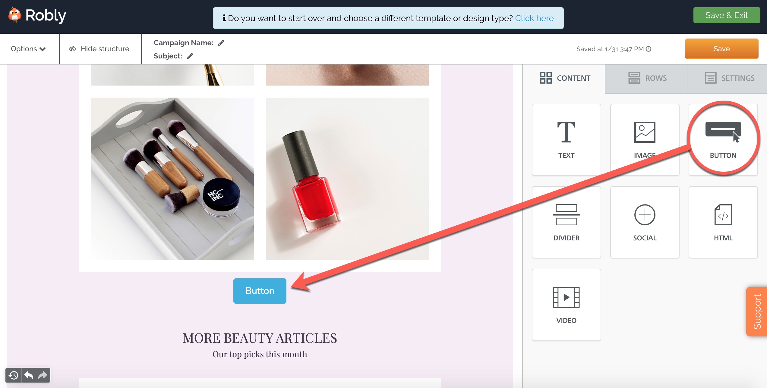
To add a button into your campaign, drag a Button module over from the Content Modules menu on the right-hand side.
Click into the button directly to edit the text that appears inside of it.
To add a link and edit other properties of the button, use the Content Properties on the right-hand side.
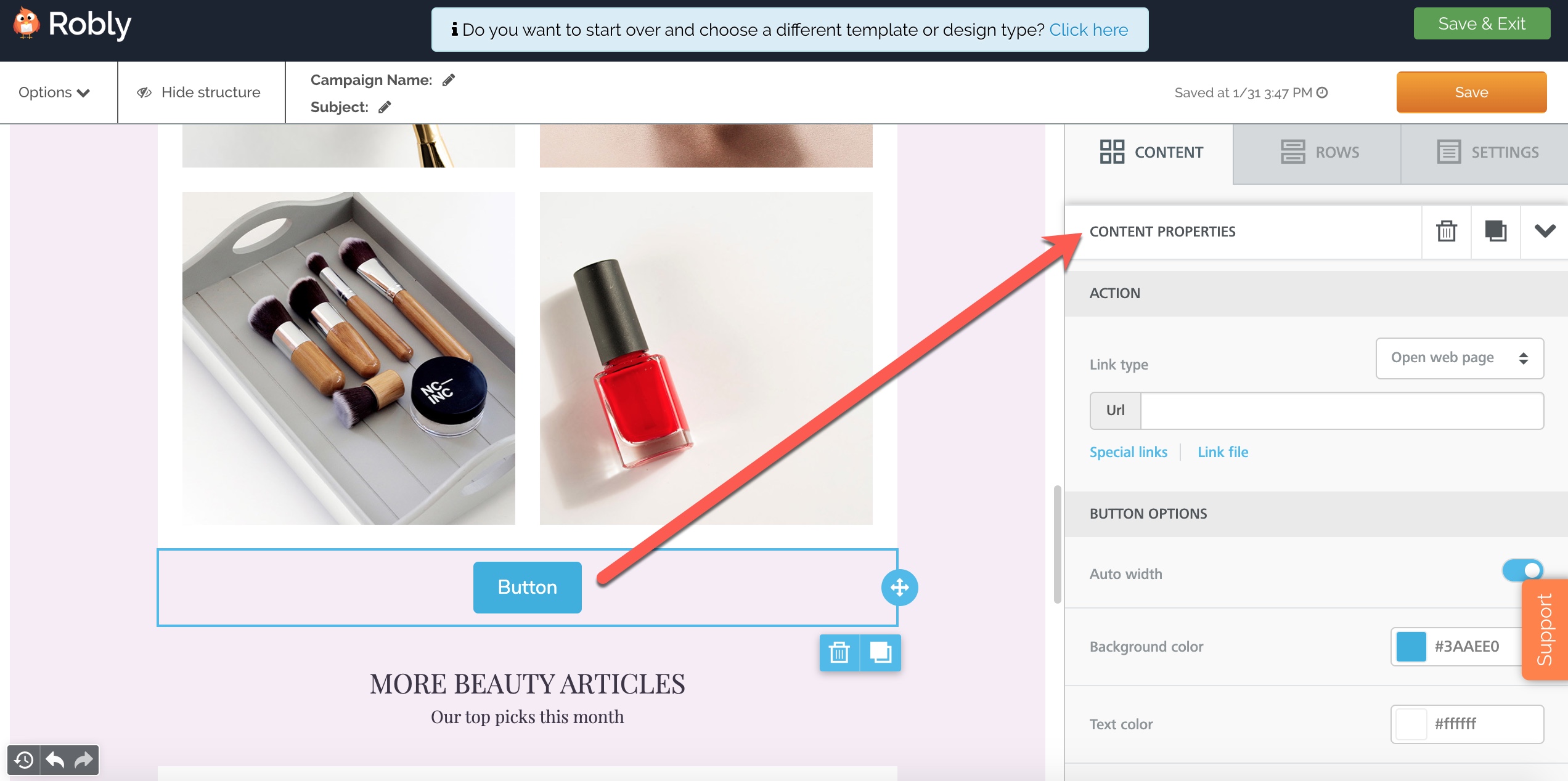
ACTION:
Use this section to choose if your button will be linking to a website, phone number, email address, or SMS.
If you’re linking to a website, add the link in the URL field. The URL must include http:// or https://.
If you want to link to a PDF, click Link File.
BUTTON OPTIONS:
Auto Width: If you want the button width to expand with the text, use this option. If you’d rather your text break on different lines, making the button taller, toggle this off.
Background color: Changes the background color of the button.
Text color: Changes the text color inside the button.
Align: Aligns the button left, center, or right.
Line Height: Adds space around the text, ie, more background color, if you increase it.
Border Radius: The higher the number, the rounder the button corners will be.
Content Padding: If this is left off, the padding will be even around all sides. To change the padding for Top, Bottom, Left, or Right separately, toggle More Options.
Border: The default is no border. Toggle More Options to add solid, dotted, or dashed border and to select its weight and color.
Have questions? Message us on chat, or email support@robly.com!